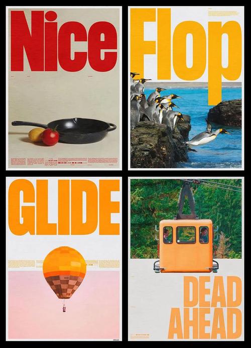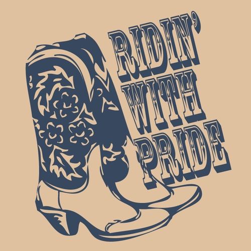
In the realm of apparel design, the fusion of vector illustrations and typography has become a powerful tool for creating compelling and marketable prints. This article explores the synergy between image, text, and design, focusing on the use of English text within vector-based graphics for clothing. We will discuss the principles of combining visuals with words, provide practical guidance, and highlight best practices for designers.
The Power of Vector Graphics in Fashion
Vector graphics are essential in apparel print design due to their scalability and crispness. Unlike raster images, vectors can be resized infinitely without loss of quality, making them ideal for screen printing, heat transfers, and embroidery. Common vector formats like AI, EPS, and SVG allow for easy manipulation of shapes, colors, and text. When designing for apparel, clear lines and bold shapes are key to effective communication.
The Role of Typography
Text in apparel design is more than just information—it is a visual element that conveys attitude, brand identity, and emotion. English typography, in particular, dominates global fashion because of its widespread recognition. Key considerations include:
- Font selection: Choose fonts that match the theme—bold sans-serif for modern, edgy looks; elegant scripts for sophistication; and distressed fonts for vintage appeal.
- Legibility: Ensure text is readable from a distance. Adjust letter spacing (tracking) and line spacing (leading) appropriately.
- Hierarchy: Use size, weight, and color to establish emphasis. The main message should stand out, with secondary text supporting it.
Combining Images and Text
A successful design integrates images and text seamlessly. Here’s how to balance them:
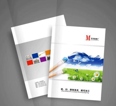
- Contrast and complement: Pair minimalist text with elaborate graphics, or let text become the main graphic. For example, a landscape vector can be silhouetted behind bold typography.
- Layering: Use overlapping elements to create depth, but avoid clutter by keeping a clear focal point.
- Color harmony: Ensure text color contrasts well with both the background and the surrounding graphics. Use palettes derived from a single scheme to maintain cohesion.
- Alignment and proximity: Group related elements together. The text should feel like a natural extension of the illustration.
Best Practices for Text-Image Design in Apparel Prints
- Start with thumbnails: Sketch composition ideas quickly to explore layouts before jumping into vector software.
- Create a mood board: Gather inspiration for typography and vector styles that resonate with your target audience.
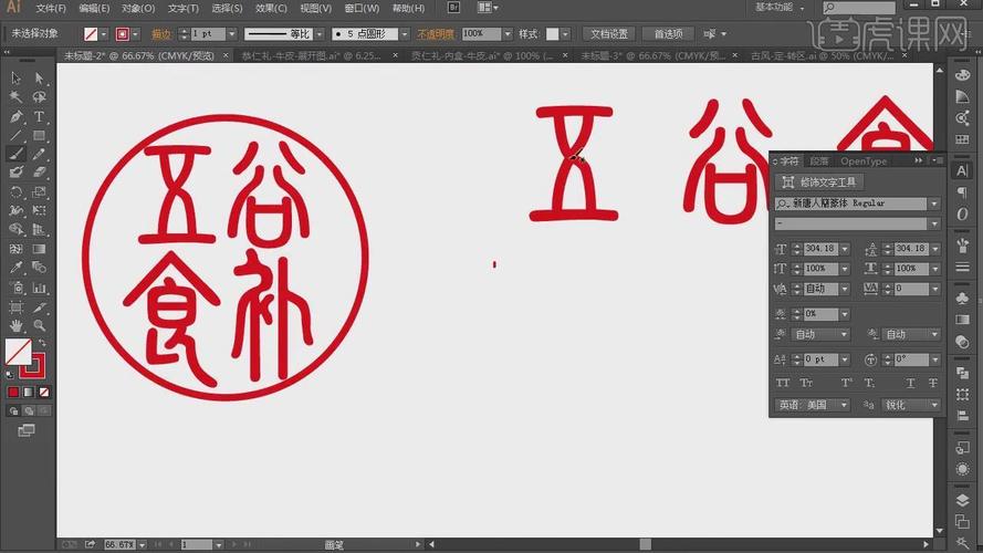
- Use grids and guides: In software like Adobe Illustrator, set up grids to align text and graphic elements precisely.
- Keep it original: Avoid overused slogans or clip art. Original vector illustrations combined with custom lettering set your design apart.
- Test print: Print a small sample on fabric to check scale, color accuracy, and readability at actual size.
- Think about placement: Front, back, sleeve, or pocket—where the design sits affects how it's perceived.
Technical Tips for Vector-Apparel Workflow
When preparing vector files with text for apparel production, remember:
- Convert text to outlines or embed fonts to avoid missing font issues at the printer.
- Maintain separate layers for text and graphics to make edits easier.
- Use spot colors (Pantone) if precise color matching is required.
- Check minimum line weights for the printing method (e.g., thicker lines for screen printing).
Case Example
Imagine a t-shirt design for a streetwear brand with the phrase 'Stay Wild' over a vector mountain range. The mountains are rendered in geometric shapes with a gradient sky. The text is in a bold, upright sans-serif font, placed centrally with slight tracking. The color palette uses muted earth tones with white text for high contrast. The result is a cohesive design where neither element overpowers the other.
Conclusion
Combining vector graphics, illustration, and English typography in apparel design requires careful consideration of visual balance, legibility, and conceptual clarity. When done well, this fusion creates designs that are not only visually striking but also commercially successful. By following the principles and tips outlined here, designers can craft unique prints that resonate with both the brand’s message and the customer's style.